Plotting Tools
PyTurbSim is equipped with a flexible set of plotting tools for plotting PyTurbSim output and comparing it to target (input) statistics. For example, the following code performs a PyTurbSim run and compares the mean profile and spectrum with the targets.
Begin by importing PyTurbSim and its plot package:
import pyts.api as pyts
import pyts.plot.api as plt
Generate some PyTurbSim data
Before we plot anything we need to create something to plot. To do
this we begin by defining some parameters, and initialize the
tsrun object, including creating the tsGrid():
refht = 4
ustar = 0.03
Uref = 3.

# This creates a PyTurbSim 'run object':
tsr = pyts.tsrun()

tsr.grid = pyts.tsGrid(center=refht,
                       ny=3,
                       nz=5,
                       height=5,
                       width=5,
                       time_sec=3000,
                       dt=0.5,)
Now specify the profile, spectral, stress and coherence models that
you wish to simulate, and run PyTurbSim (by calling tsr):
tsr.prof = pyts.profModels.h2l(Uref, refht, ustar)
tsr.spec = pyts.specModels.tidal(ustar, refht)
tsr.cohere = pyts.cohereModels.nwtc()
tsr.stress = pyts.stressModels.tidal(ustar, refht)

# Run PyTurbSim:
out = tsr()
out now contains a tsdata object which holds
the output of the PyTurbSim run tsr.
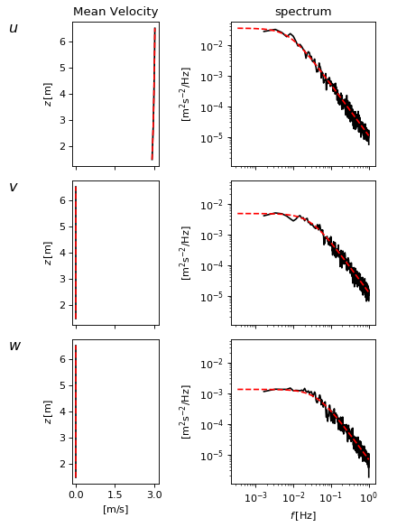
Basic plotting
Now that we have something to plot, we are ready to create a ‘PyTurbSim summary plotting figure’:
fig = plt.summfig()
Here summfig() is a wrapper function that returns a
FigAxForm object. These FigAxForm objects are
toolboxes for plotting several statistics of PyTurbSim and TurbSim
output. To plot our PyTurbSim output, out, we simply:
fig.plot(out, color='k')
When the plot method receives a
PyTurbSim ‘run’ object it plots the target values:
fig.plot(tsr, color='r', linestyle='--')
Note that this plot method accepts all of the normal
matplotlib.pyplot.plot() **kwargs. We now clean-up
(finalize) and save the figure:
fig.finalize()
fig.savefig('BasicExample.png')
(Source code, png, hires.png, pdf)

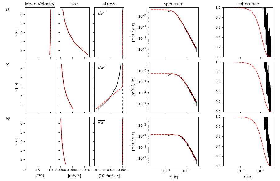
Advanced Usage
But what if you want to plot more than just the mean velocity profile and the spectrum? pyts.plot can do that too. You simply set-up your figure to plot whichever types of plots you want:
fig = plt.summfig(axforms=[plt.axform.velprof([0, 3.5]),
                           plt.axform.tkeprof(),
                           plt.axform.stressprof(),
                           plt.axform.spec(),
                           plt.axform.cohere(), ],
                           nfft=1024,
                           )
Here we are selecting different ‘axes forms’ types from the pyts.plot.axform module. Each of these axesForm objects can be customized to control various properties of the axes.
In this case, we are seeking to plot the mean velocity profile, the turbulent energy profiles, the stress profiles, the spectra and the coherence. That’s a lot of information! Fortunately, all of these statistics can be computed for our PyTurbSim output, and run. You may also notice that we have also specified nfft=1024, which tells the plotter to use that number of points when computing spec and cohere.
To plot all of these statistics, we simply follow the same steps above:
fig.plot(out, color='k')
fig.plot(tsr, color='r', linestyle='--')
fig.finalize()
fig.savefig('AdvancedExample.png')
This gives a comparison of PyTurbSim output to targets for this list of variables, with just a few lines of code!
(Source code, png, hires.png, pdf)